

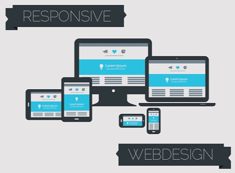
In today’s digital-first world, users access websites from a wide range of devices—including smartphones, tablets, laptops, smart TVs, and large desktop screens. With this growing diversity in screen sizes and resolutions, responsive web design has become a fundamental requirement rather than just a design trend. Responsive design ensures that websites automatically adapt their layout, content structure, and functionality to deliver an optimal viewing experience for every device and every user.
At its core, responsive design focuses on flexibility, consistency, and usability. By using fluid grids, flexible images, and adaptive layouts, websites can dynamically resize and reorganize content based on screen dimensions and orientation. This approach removes the need to create and maintain separate mobile and desktop versions of a website, reducing development costs while ensuring uniform branding and performance across all platforms.
From a user experience standpoint, responsive design significantly improves readability, navigation, and accessibility. Buttons, menus, images, and text scale appropriately, making interactions effortless regardless of device. Visitors are far more likely to stay on a website that loads quickly, looks visually balanced, and functions smoothly. As a result, responsive websites experience lower bounce rates, longer session durations, and higher conversion rates.
Responsive design also plays a crucial role in search engine optimization (SEO). Search engines prioritize mobile-friendly and responsive websites because they offer better usability and faster performance. A single responsive site improves SEO by maintaining consistent URLs, reducing duplicate content, and enhancing mobile usability. As mobile traffic continues to dominate global internet usage, responsive design has become essential for improving search visibility and ranking.
Beyond technical and performance benefits, responsive design reflects professionalism and trust. It signals that a business values its users’ time and experience, regardless of how they choose to interact with the brand. Whether it’s an e-commerce platform, corporate website, portfolio, or service portal, responsive design ensures that every user interaction feels intuitive, reliable, and polished.
In an increasingly competitive digital landscape, building websites that adapt seamlessly to every device is key to long-term success. Responsive design not only enhances usability and accessibility but also strengthens brand credibility, customer satisfaction, and overall digital growth.