A great logo is more than just a pretty picture; it's the visual cornerstone of a brand. It needs to be memorable, scalable, and tell a story in a single glance. In this article, we pull back the curtain on our creative process for the "Nova Tech" logo, showcasing the steps that transform a raw concept into a final product.
Phase 1: Discovery & The Creative Brief
It all starts with a conversation. We sat down with the team at Nova Tech to understand their vision, target audience, and core values. They needed a logo that reflected innovation, reliability, and forward momentum. This phase is all about asking the right questions and building a solid foundation.
Phase 2: Research & Mood boarding
With the brief in hand, we dove into market research. We analyzed competitors, explored industry trends, and gathered visual inspiration. This culminated in a mood board filled with typography, color palettes, and imagery that captured the essence of "innovation and trust," creating a shared visual language for the project.
Phase 3: Sketching & Conceptualization
This is where the magic begins—on paper. Our designers engaged in rapid brainstorming and sketching, exploring everything from literal representations of "nova" (a star) to abstract symbols of connectivity and growth. Dozens of rough ideas were generated, pushing creativity without the constraints of software.
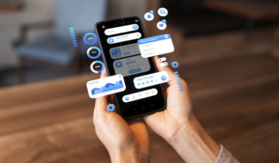
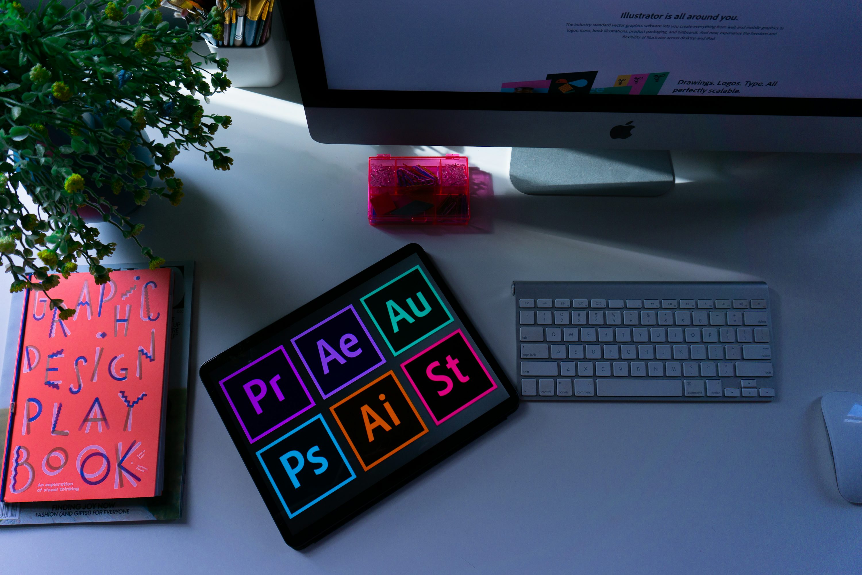
Phase 4: Digital Execution & Refinement
The strongest sketches were selected and brought into the digital realm using Adobe Illustrator. We experimented with fonts, refined shapes, and built vector-based graphics. This stage involved intense iteration, tweaking curves, and ensuring the logo worked in both color and black-and-white.
Phase 5: Presentation & Feedback
We presented three distinct concepts to the client, explaining the story and strategy behind each. Their feedback was crucial. They loved a particular concept that used a dynamic, converging form to suggest both a star and a network, but requested a tweak to the color palette.
Phase 6: Finalization & Delivery
After incorporating the client's feedback, we finalized the logo. We prepared a full brand style guide, detailing correct usage, color codes (CMYK, RGB, HEX), typography, and clearspace rules. The final files were delivered in multiple formats (AI, EPS, PNG, JPG, SVG) to ensure versatility across all media.
The journey from a blank page to a finished logo is a structured yet deeply creative adventure. It’s a testament to the power of collaboration, strategy, and design thinking.