

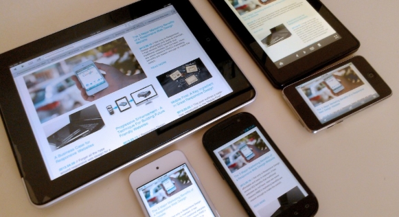
In 2026, digital experiences are no longer limited to desktops and smartphones. Users access websites through tablets, foldable devices, smart TVs, wearables, and even in-car displays. This evolution has reignited the debate between mobile-first and device-agnostic design strategies. Businesses must carefully evaluate which approach aligns best with their audience, goals, and long-term scalability.
Mobile-first design emerged as a response to the rapid growth of smartphone usage. The strategy prioritizes designing for smaller screens first, focusing on essential content, simplified navigation, and fast-loading performance. By starting with mobile constraints, designers ensure clarity, speed, and usability. In 2026, mobile traffic still dominates many industries, particularly e-commerce, social media, and local services. For these sectors, mobile-first remains highly effective.
One of the biggest strengths of mobile-first design is performance optimization. Smaller screens require leaner layouts, compressed images, and streamlined functionality. This naturally improves loading times and user experience across devices. Additionally, search engines prioritize mobile-friendly websites, making mobile-first an SEO-friendly approach.
However, the digital landscape in 2026 is more diverse than ever. Device-agnostic design takes a broader perspective by creating flexible systems that adapt seamlessly to any screen size, resolution, or interaction method. Instead of prioritizing one device, this approach focuses on responsive frameworks, scalable components, and adaptable layouts that provide consistent experiences everywhere.
Device-agnostic design is especially beneficial for businesses with varied user bases. SaaS platforms, enterprise dashboards, educational portals, and streaming services often require robust desktop functionality alongside mobile accessibility. By designing with flexibility in mind, organizations ensure a cohesive experience across smartphones, laptops, tablets, and emerging devices.
Another key consideration is user behavior. While mobile may dominate traffic, desktop users often show higher conversion rates for complex transactions such as B2B services or high-value purchases. A device-agnostic strategy ensures that both browsing convenience and advanced functionality are optimized.
In reality, the most successful websites in 2026 blend both approaches. They adopt mobile-first principles for simplicity and performance while implementing device-agnostic systems for scalability and consistency. This hybrid strategy ensures that core content remains accessible while advanced features adapt intelligently to different platforms.
Ultimately, the decision between mobile-first and device-agnostic design depends on audience insights, business objectives, and technological requirements. In a multi-device world, flexibility, speed, and user-centered thinking remain the true foundations of successful website design.